Thrive Outside
Brand refresh
Branding
The Path to Real
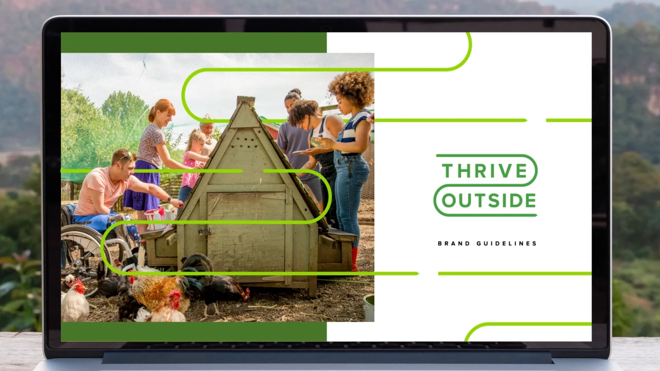
The Outdoor Foundation is dedicated to getting people outside for their health, the health of communities, and the health of the outdoor industry. Through the Foundation, the Thrive Outside initiative was born – which focuses on empowering communities to make outdoor recreation an accessible lifestyle habit for all.
Thrive’s focus is on the entire community and how everyone needs to be seen, included, and represented. Many don’t have the ability to kayak, rock climb, or bike, and not everyone has to means to participate. Proving Thrive's mission of accessibility became the fuel to refresh their brand and set a new path for change.
Data
Research reveals that shockingly, the average American spends 95% of their life inside. Additionally, if children don’t develop a sense of respect and care for nature during their first few years, they’ll likely never develop such values. With this data, we knew we had to lean in on messaging as we started to think about the full brand refresh. We had to be approachable, empathetic, and most importantly, real.
How could we break through and break down the barriers for families who don't see themselves as able to afford, or be a part of the outdoor lifestyle? Favorable data showed that 91% of kids said if a friend asked them to spend more time outdoors, they would. If we could show people that the outdoors was right outside their door and open to all, then maybe we could help them discover it on their terms, taking small steps from simple city park bike rides to easy river floats. Back to what's really 'real'.
Creative
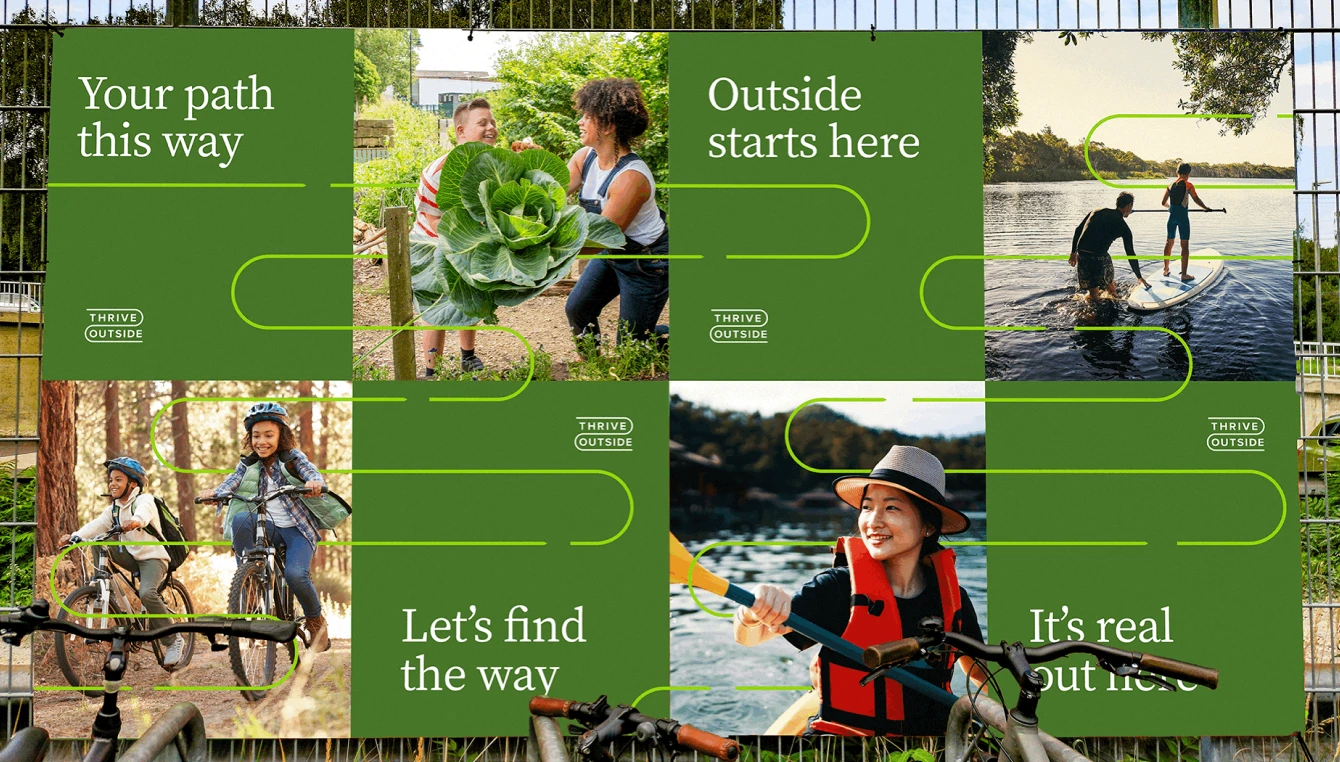
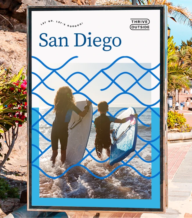
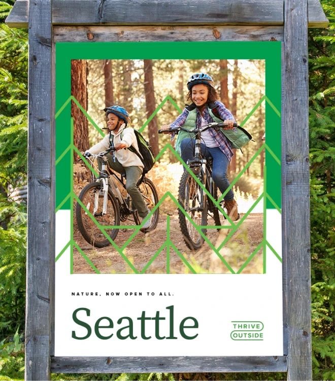
From our insights, 'The path to Real' tagline was born. Once the concept was chosen, the design, ads, and geographic palette happened naturally. The broken arrows used throughout represent a pathway, one that isn't always a clear A to B destination, but rather someone’s unique path – where they can stop, take a beat, and allow for exploration and discovery along the way.
Results
From strategy to creative, our process with the client was to work side-by-side with them to ensure we were getting the tone, look, and feel just right. Our lead client Andriana Rogers had this to say: "We are thrilled to begin bringing this new vision of Thrive to life! I know I speak for the whole team when I say that we are deeply thankful for Catalysis' incredible work on this project."
